Design creates culture. Culture shapes values. Values determine the future.
— Robert L. Peters, designer and author
— Robert L. Peters, designer and author

To build and strengthen the product to reflect the company mission of bridging the political polarization gap by delivering news from all sides.
To sharpen my skillset as a Design leader by introducing and cultivating design process and structure to a previously product/engineering led global team headquartered in Japan. I wanted to see what kind of culture and process would work best for a global team that works more remotely than on-location.
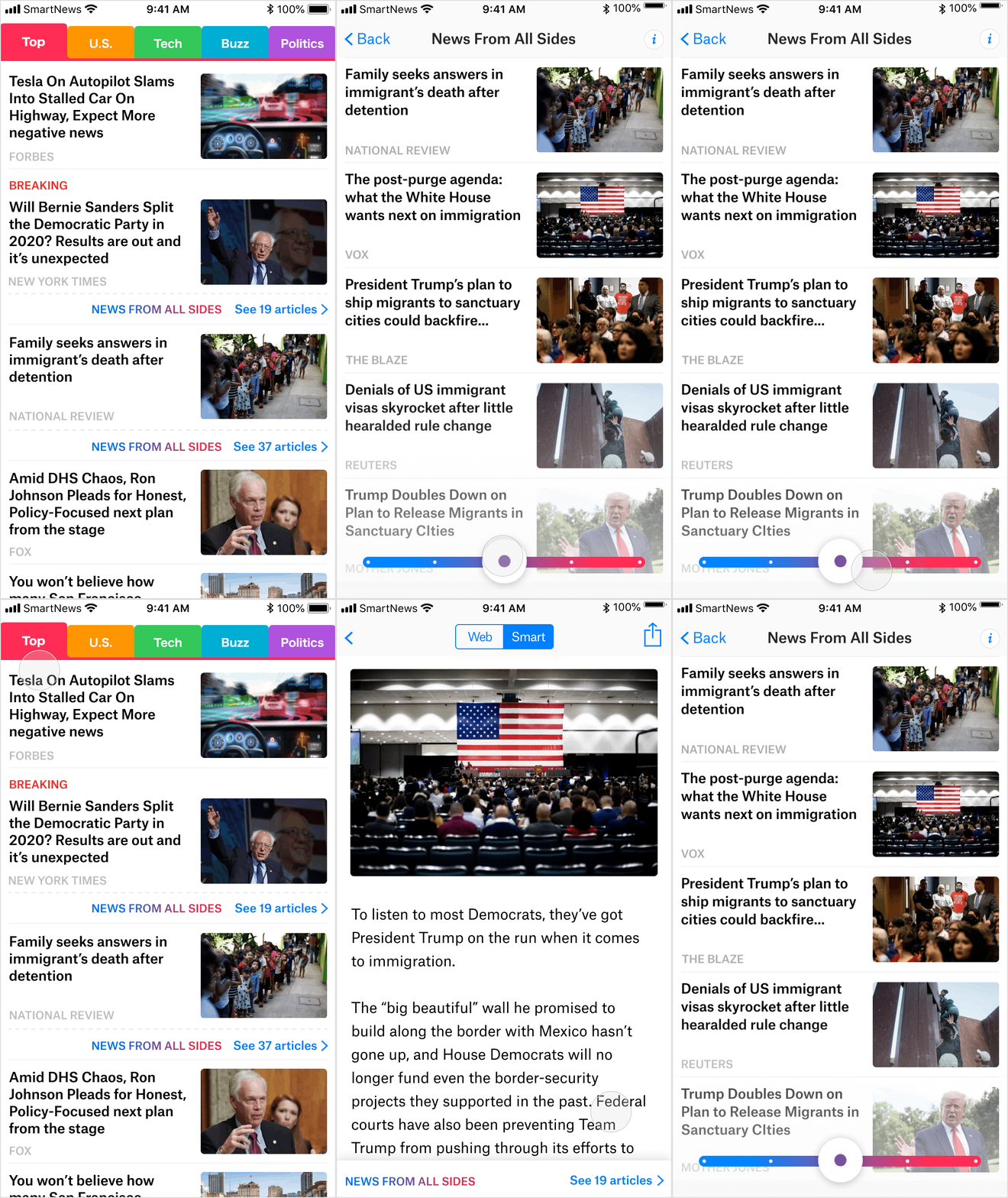
Here’s the main flow of the final screens that were launched 5 months from the beginning.


Previously, we did not have user segments, so identification really helped the team to see the product through users’ perspective.
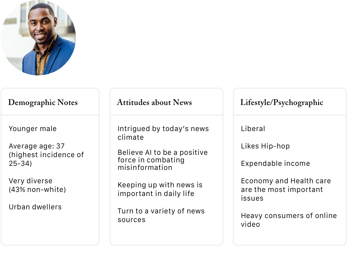
Segment 1: Michael “The Plugged-In Professional”
Plugged-in Professionals are younger, male professionals and voracious news consumers. They follow all types of news closely, are tech forward, and are most likely to pay for news subscriptions. They tend to trust digital media more than most, but still lean into television as their preferred platform for news - specifically local, US, and political news.

Segment 2: Jennifer “The Cultured Connector”
Cultured Connectors are tech-forward and leverage digital platforms heavily to consume news. They tend to be young, diverse, and liberal professionals living in the suburbs. Cultured Connectors find keeping up with the news important to their social lives.

Segment 3: David & Lisa “The Settled Suburbanites”
Settled Suburbanites are older news consumers who follow US and political news very closely. While over 4 in 10 are retired, they tend to be highly educated suburban dwellers who lean into traditional forms of media for their news content and late adopters of technology.

Concept 1: “Red vs. Blue” Balanced View without control. We wanted to know if the most obvious left and right wing distinction would give users the feeling of immediate transparency up front.

Concept 2: Balanced View with Slider (SmartNews UI). We wanted to see if providing users the ability to control what they were seeing would give them a sense of empowerment.

Concept 3: Balanced View with filter (Blue UI). This was the most practical way of controlling what users could view by turning on/off the filters.

Concept 4: Balance through “full coverage” - (Google news UI). We took out the brand logo and name to equalize user perception.
Utilizing 3 unique concepts, 1 mimicked concept and studying the user’s behavior was a technique I learned when I was building the UX department at a previous company.
By using the competitor’s design as a prototype, you can learn so much and get some questions answered; “How come they put that there? that’s so different from the norm” “ I wonder what the users think this is…”
It’s also very interesting to see how much of an impact the design loses and true user feedback competitors’ branding is not included. SmartNews did not have a user test process set up at the time, so introducing this concept test and educating the team throughout the whole process was very impactful for design and product development.
Option 2 received the most votes for being the “Most Memorable App”. As well, it was selected as the app that showed the “news from all sides” and design that most users were interested in using for Election 2020.
Users felt empowered by the fact that they could play with the “balance slider” and see the full picture
Users were very affected by the CTA copy. The fact that Option 2 said “News from all sides” gave them a good read into what they should expect next.
By giving them the glimpse into viewpoints from “the other side”, the users were more open to exposing themselves to new territories.

Contrary to the team’s belief, adding a social elements brought a lot of negative feelings to the users. There were a lot of burnt out feelings about the last election and their experience through social media. They have lost their trust in social media when it comes to politics and instead of looking at what others are saying, they would rather make that decision themselves through consuming the facts and right information themselves. Giving them a chance to participate and see what others are saying did not give the users the value that they were looking for. We decided to move forward without this idea and focus on the balance slider instead.
Led the global Design team (Japan and US), conducted 1:1s, design critiques, brainstorms, updates, and strategic planning.
Worked directly with the SVP of Product and led cross functional strategy meetings, overseeing designs and user research for the growth pillar.
Building a Design system for the team, including the first component library which sped up cross functional team work by approximately 33%.
Added User Research as an integral part of the Design process; introduced, managed, conducted, presented the learnings and connected it to the appropriate next move; trained the entire design team to utilize User Research within design tool set.
Implemented “Design Statements” as an essential process for the design/product teams to re-align and guide project development by ensuring check-in and accountability for users’ value points and cross functional collaboration.
Worked closely with the Marketing team to bridge the gap between product and marketing; was creative director on marketing materials across various product ads (social media and TV), ensuring product and the users value proposition were clearly communicated through brand voice.
“ Jihee is the best design manager I have ever worked with. In the past year, her genuine empathy for users, wealth of design leadership experience, personal mentorship, and spearheading the revamp of SmartNews’ design system has prepared us to scale as an organization and grow immensely as individuals.
Jihee is a born leader. She not only mentors designers, but also empowers them to reach their fullest potential. I’ve experienced this first-hand, and feel that I am better prepared for the rest of my career than ever before now. Additionally, Jihee has an amazing eye for user interface design and shapes product design strategy at every level. She effectively communicates with and helps align every team in order to smoothly launch features and achieve major milestones.
She also meticulously examines design components and their affordances, creating world-class experiences that are cross-platform and easy to understand. This attention to detail has also been passed onto the rest us because Jihee developed best practices for ensuring that our product maintains a high level of quality, speed and excellence moving forward.
Lastly, I have used and trusted the apps Jihee has lead design for at Smule, GameTime, and Life360 long before we ever met. I’ve been extremely privileged to have worked on Jihee’s design team at SmartNews.”
- Peter Wong, Sr. Product Designer